Widgets
Flyy Widget
Introduction
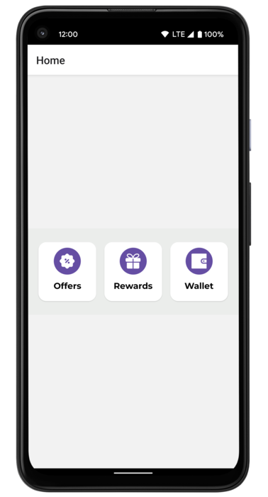
The Flyy Widget provides a ready-to-use entry point leading to the Flyy SDK's Primary Screens. Namely, the Offers Screen, Rewards Screen, and Wallet Screen. This widget allows various customizations to match your project's theme and style.
Usage
To add the Flyy Widget, add the following element to your layout:
<>
  <FlyyWidget/>
</>

We recommend placing the Flyy Widget on your app's home screen for greater visibility and thus better engagement.
Customization
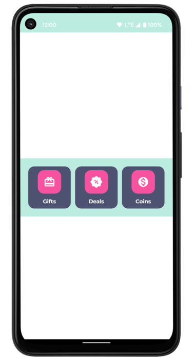
The widget can be customized to match the style and theme of your application. Refer to the table below to learn about all the properties that can be changed.
<FlyyWidget
  widgetStyle={{
    containerBackgroundColor: "#BCECE0",
  }}
/>

Customized Flyy Widget
FlyyWidget Properties
| Description | Property | Example Value |
|---|---|---|
| Container's background color | containerBackgroundColor | '#bcece0''white' |
| Button's background color | buttonBackgroundColor | '#bcece0''white' |
| Button corner radius | buttonCornerRadius | 15.0 |
| Border width for the buttons | buttonBorderWidth | 1.0 |
| Border color for the buttons | buttonBorderColor | '#bcece0''white' |
| Icon background color | buttonIconBackgroundColor | '#bcece0''white' |
| Corner radius for the container around the icon | iconCornerRadius | 20.0 |
| Font family of the button titles. | buttonTitleFontFamily | 'Montserrat-Bold' |
| Text color of the button titles | buttonTitleTextColor | '#bcece0''white' |
| Font size of the button titles | buttonTitleTextSize | 14.0 |
| Title of the Offers button | offerButtonTitle | 'Deal' |
| Title of the Rewards button | rewardButtonTitle | 'Gift' |
| Title of the Wallet button | walletButtonTitle | 'Coins' |
| Path to asset image for Offers button icon | offersButtonIcon | '/assets/images/offerwidget.png' |
| Path to asset image for Rewards button icon drawable | rewardsButtonIcon | '/assets/images/rewardwidget.png' |
| Path to asset image for Wallet button icon drawable | walletButtonIcon | '/assets/images/walletwidget.png' |
Updated over 3 years ago
