Widgets
Flyy Widget
Introduction
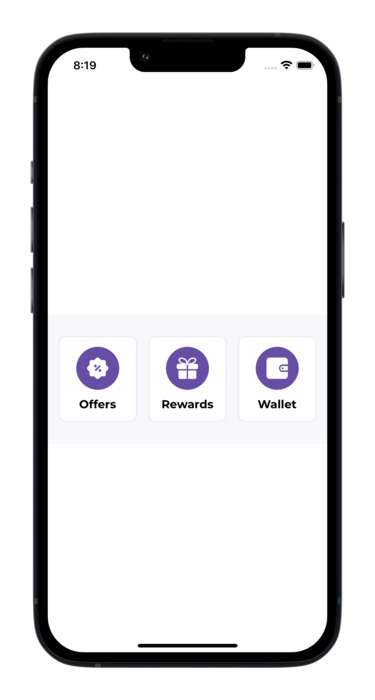
The Flyy Widget is a UI element that provides a ready-to-use entry point leading to the Flyy SDK's Primary Screens. Namely, the Offers Screen, Rewards Screen, and Wallet Screen. This widget allows various customizations to match your project's theme and style.
Usage
Adding the FlyyWidget requires loading a custom class on a UI view and then creating an outlet in the view controller to modify the FlyyWidget class's properties. The following steps demonstrate how to achieve this.
Step 1: Add UIView
UIViewThe Flyy Widget is a Custom Class loaded onto a UIView.
Therefore, add a UIView object to your view.
Set the constraints of this view such that it can take up the full width of the view and set its height to 180.
Step 2: Load a Custom Class
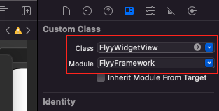
Open the Identity Inspector and load the FlyyWidgetView class from the FlyyFrameWork module while keeping the newly added UIView selected.

Step 3: Create an Outlet
Create an outlet for this view in the UIViewController to be able to customize the Widget
class ViewController: UIViewController
{

    @IBOutlet weak var flyyWidget: FlyyWidgetView!

    override func viewDidLoad() {
        super.viewDidLoad()

        flyyWidget.containerBackgroundColor = "#ffffff"

}
Build the app and the TheFlyyWidget is now usable.

Customization
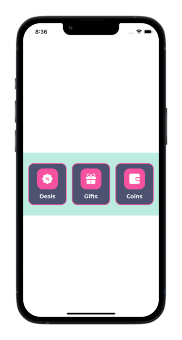
The widget can be customized to match the style and theme of your application. Refer to the table below to learn about all the properties that can be changed.

Customized Flyy Widget
FlyyWidget Properties
| Description | Attribute | Example Value |
|---|---|---|
| Container's background color | containerBackgroundColor | "#ebebeb" |
| Button's background color | buttonBackgroundColor | "#ebebeb" |
| Button corner radius | buttonCornerRadius | "15" |
| Border width for the buttons | buttonBorderWidth | "2" |
| Border color for the buttons | buttonBorderColor | "#ffffff" |
| Icon background color | buttonIconBackgroundColor | "#ffffff" |
| Corner radius for the container around the icon | iconCornerRadius | "15" |
| Text color of the button titles | buttonTitleTextcolor | "#808080" |
| Font size of the button titles | buttonTitleFontSize | "14" |
| Title of the Offers button | offersButtonTitle | "Deals" |
| Title of the Rewards button | rewardsButtonTitle | "Prizes" |
| Title of the Wallet button | walletButtonTitle | "Coins" |
| Offers button icon | offersButtonIconURL | "https://picsum.photos/100" |
| Rewards button icon | rewardsButtonIconURL | "https://picsum.photos/100" |
| Wallet button icon | walletButtonIconURL | "https://picsum.photos/100" |
Updated almost 4 years ago
